Mando, Baxter, (blank)
Remember how we used to know the names of the various paper grades our comics were printed on?
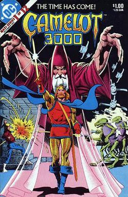
Of course there was always newsprint, but its quality seemed to worsen drastically by the end of the 1970s. With the publication of DC's Camelot 3000 in 1982, the arrival of Baxter paper was hailed. It was very white and the colors were very bright. DC's learning curve was steep and the palette became far more muted by the time Lynn Varley was coloring their Thriller in 1983. Our fascination with the heavy Baxter paper lasted a few more years but it was, well, just a little too showy.
I was far more impressed with Mando paper when it came down the pike. Almost as white as Baxter but not as heavy, Mando held the color well and the image did not bleed through from the other side of the page (as had been happening with newsprint). When I would see some beautiful Don Newton artwork on Mando paper I remember thinking to myself that this was the perfect quality of paper for a comic book. But they would not leave well enough alone.
Over at Marvel Comics, the Marvel Fanfare title experimented with a glossy, slick, coated magazine stock. They described it as having every page feeling like the cover. For weeks now I have been trying to remember the name of the paper that Fanfare was printed on. It was a word that was not bandied about with the same regularity as Baxter or Mando, but I knew I had read it once or twice anyway. As I was researching to find the missing word, I found that many other individuals had struggled with locating it. I even found out from Facebook that one person in Phoenix is named Mando Baxter!
After many frustrating dead ends I did find out what that word was. It may take a while sometimes, but we do get to the bottom of things in the hayfamzone. The glossy, slick, coated magazine stock that Marvel Fanfare was printed on was called Hudson paper. Maybe I shouldn't say was. Maybe it's still called Hudson paper, and now we're getting to my point (finally, did you say?).
The vast majority of today's DC and Marvel and most other comics are printed on what I would call Hudson paper. Oh, they don't call it that. The one or two times I originally read the phrase "Hudson paper" was over twenty years ago. But (with rare exceptions) today's comics are printed on glossy, slick, coated magazine stock, and that is a tragedy.
I hate it! It doesn't look or feel like what a comic book should look or feel like! I've suffered in silence because I hadn't heard any other rumblings and I thought I was alone in my dislike for the glossiness, but no! There is a whole underground of comics fans who hate this glossy, slick, coated magazine stock for their comics! Look what I found written by Kim Thompson of Fantagraphics:
It is profoundly astonishing to me that ANYONE, let alone major publishers, is still subscribing to the weird notion that printing a comic on coated (a.k.a. glossy, a.k.a. shiny) stock is somehow fancier and better and more collectalicious. Granted that we (and Kitchen Sink and that whole generation of alternative publishers) went through that madness back in the 1980s and 1990s, we got cured eventually and realized that 98% of comics look better on uncoated stock, and NO comic looks good on outright glossy stock.So if anybody's ready to organize the revolt, I will march by your side. And if you're not sure what all this noise is about, take a look at the latest issue of Vertigo's Fables. Notice how that title, one of the few exceptions in today's world of comics, is not printed on glossy, slick, coated magazine stock. It's just a nice, white paper, equivalent in my mind to Mando paper (but nobody seems to use that phrase anymore). Imagine a paradise where all comic books are printed on that nice paper and I think you might be ready also to lace up your marching boots.


